Руководство Bootstrap Position Utility
1. Обзор Bootstrap Position
Bootstrap построил некоторые готовые классы для настройки позиции (Position) для элементов:
- .position-static
- .position-relative
- .position-absolute
- .position-fixed
- .position-sticky
Вместо использования классов выше вы можете использовать следующие Css property для получения одинакового результата:
- style="position:static"
- style="position:relative"
- style="position:absolute"
- style="position:fixed"
- style="position:sticky"
Помимо этого, некоторые другие классы так же очень полезны, и вам будет легко понять их цель:
- .fixed-top
- .fixed-bottom
- .sticky-top
2. Class .position-static
Элементы в HTML расположены статически (Positioned static) по умолчанию, это значит их позиции определены по обычным правилам страницы. Они не задеты Css property: left, right, top, bottom если вы намеренно создаете для них настройки.
Примечание: Вместо использования класса .position-static у Bootstrap, вы можете использовать Css property (position: static) для получения одинакового результата.
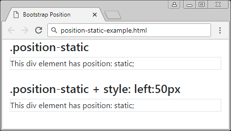
positon-static-example
<div class= "container-fluid">
   <h4>.position-static</h4>
   <div class="position-static border">
      This div element has position: static;
   </div>
   <br>
   <h4>.position-static + style: left:50px</h4>
   <div class="position-static border" style="left:50px">
      This div element has position: static;
   </div>
</div>
3. Class .position-relative
Элемент, к которому применяется класс .position-relative похож на тот, к которому применили Css property (postion: relative). Это значит он будет расположен относительно его обычной позиции (positioned relative). Другими словами вы можете использовать Css property (left, right, top, bottom) для регулирования (передвижения) позиции слева, справа, сверху, снизу по отношению к его обычному расположению.
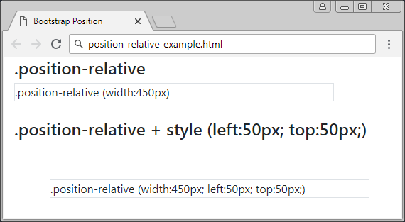
position-relative-example.html
<div class= "container-fluid">
   <h4>.position-relative</h4>
   <div class="position-relative border" style="width:450px;">
      .position-relative (width:450px)
   </div>
   <br>
   <h4>.position-relative + style (left:50px; top:50px;)</h4>
   <div class="position-relative border" style="left:50px; top:50px; width:450px;">
      .position-relative (width:450px; left:50px; top:50px;)
   </div>
</div>
4. Class .position-fixed
Элемент, к которому применяется класс .position-fixed похож на тот, к которому применили Css property (position: fixed).Это значит он будет расположен относительно (positioned relative) по отношению к окну просмотра (viewport) браузера.
В следующем примере, элемент зафиксирован к низу (bottom) и правой стороне (right) окна просмотра (viewport):

position-fixed-example
<div class= "container-fluid">
   <h4>.position-fixed</h4>
   <div class="position-fixed border bg-info" style="bottom:10px; right:5px;">
      .position-fixed (bottom:10px; right:5px;)
   </div>
   <p>Info.. 1</p>
   <p>Info.. 2</p>
   <p>Info.. 3</p>
   <p>Info.. 4</p>
   <p>Info.. 5</p>
</div>
Особенная характериска элемента с {position: fixed} это вы можете закрепить (anchor) 4 его стороны с 4-мя сторонами окна просмотра (viewport) браузера. В том случае, если размер viewport (окна просмотра) меняется, размер данного элемента так же меняется. Он похож на изображение ниже:
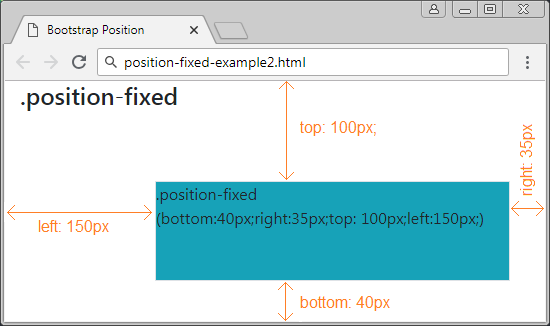
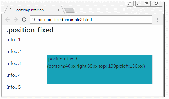
position-fixed-example2
<div class= "container-fluid">
   <h4>.position-fixed</h4>

   <div class="position-fixed border bg-info"
      style="bottom:40px;right:35px;top: 100px;left:150px;">
      .position-fixed <br>

      (bottom:40px;right:35px;top: 100px;left:150px;)
   </div>

   <p>Info.. 1</p>
   <p>Info.. 2</p>
   <p>Info.. 3</p>
   <p>Info.. 4</p>
   <p>Info.. 5</p>
</div>
5. Class .position-absolute
Элемент к которому применен класс.position-absolute (Абсолютная позиция) будет искать свой ближайший родительский элемент (родительский, прародительский,..) который имеет {position: relative}. После нахождения он настроит относительную позицую по отношению к окну просмотра (Viewport) браузера.


position-absolute-example
<div class= "container-fluid">
   <h4 class="mb-3">.position-absolute example</h4>

   <div class="position-relative border border-danger" style="height:200px;">
      .position-relative

      <div class="position-absolute border bg-info" style="bottom:10px; right:15px;">
         .position-absolute (bottom:10px; right:15px;)
      </div>

   </div>

</div>
position-absolute-example2
<div class= "container-fluid">
   <h4 class="mb-3">.position-absolute example</h4>

   <div class="position-relative border border-danger" style="height:250px;">
      .position-relative
      <div class="position-absolute border bg-info"
         style="bottom:40px;right:35px;top: 100px;left:150px;">
         .position-absolute (bottom:40px;right:35px;top: 100px;left:150px;)
      </div>
   </div>

</div>
6. Class .position-sticky
Элемент к которому применили класс .position-sticky похож на тот, к которому применили Css property (position: sticky). Его позиция основана на позиции прокрутки (scoll position) пользователя.
Элемент Sticky поменяется с "relative" на "fixed" или наоборот, в зависимости от позиции прокрутки пользователя.
Примечание: Браузер IE/Edge версии 15 или старее не поддерживает {position: sticky}.

position-sticky-example.html
<!DOCTYPE html>
<html>
   <head>
      <meta charset="utf-8">
      <title>Bootstrap Position</title>
      <link rel="stylesheet" href="https://stackpath.bootstrapcdn.com/bootstrap/4.1.1/css/bootstrap.min.css">
   </head>
   <body>
      <div class= "container-fluid">
         <h4 class="mb-3">.position-sticky example</h4>
         <hr>
         <b>Try to scroll inside this frame to understand how sticky positioning works.</b>
         <p class="text-danger">
            Note: IE/Edge 15 and earlier versions do not support sticky position.
            I am sticky!
         </p>
         <div class="position-sticky border bg-info" style="top:5px;">
            .position-sticky (top:5px;)
         </div>

         <p>
            Lorem ipsum dolor sit amet, illum definitiones no quo, maluisset concludaturque et eum,
            altera fabulas ut quo. Atqui causae gloriatur ius te, id agam omnis evertitur eum.
            Affert laboramus repudiandae nec et. Inciderint efficiantur his ad. Eum no molestiae voluptatibus.
         </p>
      </div>
      <script src="https://code.jquery.com/jquery-3.3.1.slim.min.js"></script>
      <script src="https://cdnjs.cloudflare.com/ajax/libs/popper.js/1.14.3/umd/popper.min.js"></script>
      <script src="https://stackpath.bootstrapcdn.com/bootstrap/4.1.1/js/bootstrap.min.js"></script>
   </body>
</html>
7. Class .fixed-top, fixed-bottom, .sticky-top
Класс .fixed-top применяется к элементу для фиксирования его к верху окна просмотра (viewport) браузера. (Смотрите объяснение в разделе .position-fixed)
.fixed-top (Bootstrap code)
.fixed-top {
    position: fixed;
    top: 0;
    right: 0;
    left: 0;
    z-index: 1030;
}
Класс .fixed-bottom применяется к элементу для фиксирования его к низу окна просмотра (viewport) браузера. (Смотрите объяснение в разделе .position-fixed)
.fixed-bottom (Bootstrap Code)
.fixed-bottom {
    position: fixed;
    right: 0;
    bottom: 0;
    left: 0;
    z-index: 1030;
}
.sticky-top
Класс .sticky-top довольно похож на .position-sticky, вы можете посмотреть объяснение в разделе .position-sticky.
.sticky-top (Bootstrap Code)
.sticky-top {
    position: -webkit-sticky; /* Safari Browser */
    position: sticky;
    top: 0;
    z-index: 1020;
}
Pуководства Bootstrap
- Руководство Bootstrap Jumbotron
- Руководство Bootstrap Dropdown
- Руководство Bootstrap Alert
- Руководство Bootstrap Buttons
- Руководство Bootstrap Button Group
- Руководство Bootstrap Popover (Tooltip)
- Руководство Bootstrap Spinner
- Введение в Bootstrap
- Руководство Bootstrap Grid System
- Руководство Bootstrap Card
- Руководство Bootstrap Container
- Руководство Bootstrap Nav, Tab, Pill
- Руководство Bootstrap NavBar
- Руководство Bootstrap Table
- Руководство Bootstrap Modal
- Руководство Bootstrap Form
- Руководство Bootstrap Pagination
- Руководство Bootstrap Badge
- Руководство Bootstrap Input Group
- Руководство Bootstrap List Group
- Руководство Bootstrap ProgressBar
- Руководство Bootstrap Collapse и Accordion
- Руководство Bootstrap Scrollspy
- Руководство Bootstrap Breadcrumb
- Руководство Bootstrap Carousel
- Руководство Bootstrap Spacing Utility
- Руководство Bootstrap Border Utility
- Руководство Bootstrap Color Utility
- Руководство Bootstrap Text Utility
- Руководство Bootstrap Sizing Utility
- Руководство Bootstrap Position Utility
- Руководство Bootstrap Flex Utility
- Руководство Bootstrap Display Utility
- Руководство Bootstrap Visibility Utility
- Руководство Bootstrap Embed Utility
Show More