Руководство Bootstrap Embed Utility
1. Bootstrap Embed
Иногда вам нужно вставить медиаконтент (media) в страницу HTML, например Video, PDF,... Он может не подходить всем устройствам с разными ширинами экрана. Поэтому Bootstrap дает утилитарные классы для разрешения данной проблемы.
<object> / PDF ...
Это простой пример использования <object> чтобы вставить файл PDF в страницу HTML, но окно отображения PDF не подходит окну просмотра (viewport) браузера.
object-pdf-non-responsive-example.html
<!DOCTYPE html>
<html>
   <head>
      <meta charset="utf-8">
      <title>HTML object PDF</title>
   </head>
   <body>
      <h3 class="mb-3">Non-Responsive object PDF</h3>

      <object data="example.pdf" type="application/pdf" internalinstanceid="9" title="">
         <p>
            Your browser isn't supporting embedded pdf files.
            You can download the file
            <a href="example.pdf">here</a>.
         </p>
      </object>

   </body>
</html>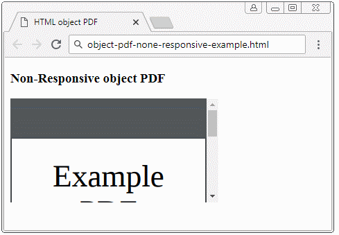
<iframe> / video ...
И другой простой пример использования <iframe> для отображения Video на странице HTML. Похоже на пример с PDF выше, video отображается несовместимо с разными устройствами.
iframe-non-responsive-example.html
<!DOCTYPE html>
<html>
   <head>
      <meta charset="utf-8">
      <title>HTML iframe</title>
   </head>
   <body>
      <h3 class="mb-3">Non-Responsive iframe</h3>

      <iframe
         src="https://www.youtube.com/embed/zpOULjyy-n8?rel=0" allowfullscreen>
      </iframe>

   </body>
</html>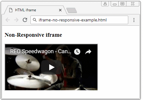
И далее является разрешение Bootstrap:
- Обернуть (wrap) <iframe>/<object>/.. с помощью <div class="embed-responsive embed-responsive-*by*">. При этом: (*) это число, я объясню более детально об этом ниже.
- Применить класс .embed-responsive-item к <iframe>/<object>/...
<!-- object/ PDF ... -->
<div class="embed-responsive embed-responsive-16by9">
   <object class="embed-responsive-item" data="example.pdf"
      type="application/pdf" internalinstanceid="9" title="">
      <p>
         Your browser isn't supporting embedded pdf files. You can download the file
         <a href="example.pdf">here</a>
      </p>
   </object>
</div>

<!-- iframe/ Video ... -->
<div class="embed-responsive embed-responsive-16by9">
   <iframe class="embed-responsive-item"
      src="https://www.youtube.com/embed/zpOULjyy-n8?rel=0" allowfullscreen>
   </iframe>
</div>
И результат получился совсем неплохим!
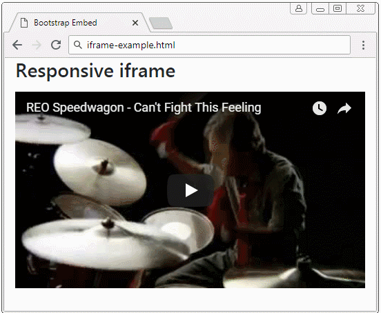
iframe-example.html
<!DOCTYPE html>
<html>
   <head>
      <meta charset="utf-8">
      <title>Bootstrap Embed</title>
      <link rel="stylesheet" href="https://stackpath.bootstrapcdn.com/bootstrap/4.1.1/css/bootstrap.min.css">
   </head>
   <body>
      <h3 class="mb-3">Responsive iframe</h3>

      <div class="embed-responsive embed-responsive-16by9">
         <iframe class="embed-responsive-item"
            src="https://www.youtube.com/embed/zpOULjyy-n8?rel=0" allowfullscreen>
         </iframe>
      </div>

      <script src="https://code.jquery.com/jquery-3.3.1.slim.min.js"></script>
      <script src="https://cdnjs.cloudflare.com/ajax/libs/popper.js/1.14.3/umd/popper.min.js"></script>
      <script src="https://stackpath.bootstrapcdn.com/bootstrap/4.1.1/js/bootstrap.min.js"></script>
   </body>
</html>
.embed-responsive-*by*
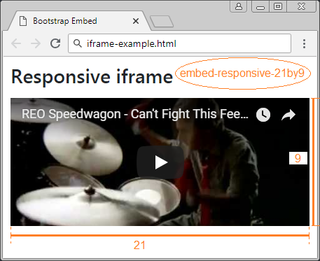
Некоторые готовые классы построены в Bootstrap для настройки соотношения между шириной и высотой media.
- embed-responsive-21by9
- embed-responsive-16by9
- embed-responsive-4by3
- embed-responsive-1by1
.embed-responsive-*by*
<!-- 21:9 aspect ratio -->
<div class="embed-responsive embed-responsive-21by9">
   <iframe class="embed-responsive-item" src="..."></iframe>
</div>

<!-- 16:9 aspect ratio -->
<div class="embed-responsive embed-responsive-16by9">
   <iframe class="embed-responsive-item" src="..."></iframe>
</div>

<!-- 4:3 aspect ratio -->
<div class="embed-responsive embed-responsive-4by3">
   <iframe class="embed-responsive-item" src="..."></iframe>
</div>

<!-- 1:1 aspect ratio -->
<div class="embed-responsive embed-responsive-1by1">
   <iframe class="embed-responsive-item" src="..."></iframe>
</div>
2. Custom .embed-responsive-*by*
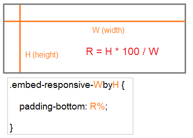
Вы можете создать кастомизированный класс .embed-responsive-*by*, например .embed-responsive-5by4.
.embed-responsive-5by4
.embed-responsive-5by4 {
  padding-bottom: 80.0%;
}
Общая формула:
210:297 является соотношением между шириной и высотой листа A4. И вы можете определить класс .embed-responsive-210by297 следующим образом:
.embed-responsive-210by297
.embed-responsive-210by297 {
  padding-bottom: 141.42%;
}
object-pdf-responsive-example
<style>
   .embed-responsive-210by297 {
   padding-bottom: 141.42%;
   }
</style>

<div class="embed-responsive embed-responsive-210by297">
<object class="embed-responsive-item" data="example.pdf"
   type="application/pdf" internalinstanceid="9" title="">
   <p>
      Your browser isn't supporting embedded pdf files. You can download the file
      <a href="example.pdf">here</a>.
   </p>
</object>
</div
Pуководства Bootstrap
- Руководство Bootstrap Jumbotron
- Руководство Bootstrap Dropdown
- Руководство Bootstrap Alert
- Руководство Bootstrap Buttons
- Руководство Bootstrap Button Group
- Руководство Bootstrap Popover (Tooltip)
- Руководство Bootstrap Spinner
- Введение в Bootstrap
- Руководство Bootstrap Grid System
- Руководство Bootstrap Card
- Руководство Bootstrap Container
- Руководство Bootstrap Nav, Tab, Pill
- Руководство Bootstrap NavBar
- Руководство Bootstrap Table
- Руководство Bootstrap Modal
- Руководство Bootstrap Form
- Руководство Bootstrap Pagination
- Руководство Bootstrap Badge
- Руководство Bootstrap Input Group
- Руководство Bootstrap List Group
- Руководство Bootstrap ProgressBar
- Руководство Bootstrap Collapse и Accordion
- Руководство Bootstrap Scrollspy
- Руководство Bootstrap Breadcrumb
- Руководство Bootstrap Carousel
- Руководство Bootstrap Spacing Utility
- Руководство Bootstrap Border Utility
- Руководство Bootstrap Color Utility
- Руководство Bootstrap Text Utility
- Руководство Bootstrap Sizing Utility
- Руководство Bootstrap Position Utility
- Руководство Bootstrap Flex Utility
- Руководство Bootstrap Display Utility
- Руководство Bootstrap Visibility Utility
- Руководство Bootstrap Embed Utility
Show More