Руководство Flutter BottomNavigationBar
1. BottomNavigationBar
Нижняя панель навигации (navigation bar) - это традиционный стиль приложений iOS. В Flutter вы можете сделать это с помощью BottomNavigationBar. Кроме того, BottomNavigationBar также имеет удобную функцию, которая позволяет прикрепить к ней FloatingActionButton.
BottomNavigationBar Constructor:
BottomNavigationBar Constructor
BottomNavigationBar(
    {Key key,
    @required List<BottomNavigationBarItem> items,
    ValueChanged<int> onTap,
    int currentIndex: 0,
    double elevation,
    BottomNavigationBarType type,
    Color fixedColor,
    Color backgroundColor,
    double iconSize: 24.0,
    Color selectedItemColor,
    Color unselectedItemColor,
    IconThemeData selectedIconTheme,
    IconThemeData unselectedIconTheme,
    double selectedFontSize: 14.0,
    double unselectedFontSize: 12.0,
    TextStyle selectedLabelStyle,
    TextStyle unselectedLabelStyle,
    bool showSelectedLabels: true,
    bool showUnselectedLabels,
    MouseCursor mouseCursor}
)
BottomNavigationBa обычно помещается в Scaffold через свойство AppBar.bottomNavigationBar, и она появится в нижней части Scaffold.

BottomNavigationBarдовольно похожа на BottomAppBar с точки зрения использования. BottomNavigationBar предлагает шаблон для панели навигации, поэтому она проста и удобна в использовании. Однако, если вы хотите раскрыть свой творческий потенциал, используйте панель BottomAppBar.
2. Example
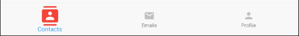
Давайте начнем с полного примера с BottomNavigationBar. Это поможет вам понять, как работает этот Widget.
main.dart (ex1)
import 'package:flutter/material.dart';
void main() {
runApp(MyApp());
}
class MyApp extends StatelessWidget {
@override
Widget build(BuildContext context) {
return MaterialApp(
title: 'Title of Application',
theme: ThemeData(
primarySwatch: Colors.blue,
visualDensity: VisualDensity.adaptivePlatformDensity,
),
home: MyHomePage(),
);
}
}
class MyHomePage extends StatefulWidget {
MyHomePage({Key key}) : super(key: key);
@override
State<StatefulWidget> createState() {
return MyHomePageState();
}
}
class MyHomePageState extends State<MyHomePage> {
int selectedIndex = 0;
Widget _myContacts = MyContacts();
Widget _myEmails = MyEmails();
Widget _myProfile = MyProfile();
@override
Widget build(BuildContext context) {
return Scaffold(
appBar: AppBar(
title: Text("BottomNavigationBar Example"),
),
body: this.getBody(),
bottomNavigationBar: BottomNavigationBar(
type: BottomNavigationBarType.fixed,
currentIndex: this.selectedIndex,
items: [
BottomNavigationBarItem(
icon: Icon(Icons.contacts),
title: Text("Contacts"),
),
BottomNavigationBarItem(
icon: Icon(Icons.mail),
title: Text("Emails"),
),
BottomNavigationBarItem(
icon: Icon(Icons.person),
title: Text("Profile"),
)
],
onTap: (int index) {
this.onTapHandler(index);
},
),
);
}
Widget getBody( ) {
if(this.selectedIndex == 0) {
return this._myContacts;
} else if(this.selectedIndex==1) {
return this._myEmails;
} else {
return this._myProfile;
}
}
void onTapHandler(int index) {
this.setState(() {
this.selectedIndex = index;
});
}
}
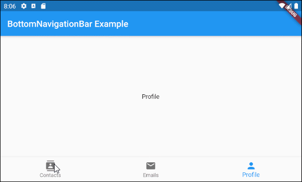
class MyContacts extends StatelessWidget {
@override
Widget build(BuildContext context) {
return Center(child: Text("Contacts"));
}
}
class MyEmails extends StatelessWidget {
@override
Widget build(BuildContext context) {
return Center(child: Text("Emails"));
}
}
class MyProfile extends StatelessWidget {
@override
Widget build(BuildContext context) {
return Center(child: Text("Profile"));
}
}3. items
Свойство items используется для определения списка элементов панели BottomNavigationBar. Это свойство является обязательным, и количество элементов должно быть больше или равно 2, иначе вы получите ошибку.
@required List<BottomNavigationBarItem> itemsBottomNavigationBarItem Constructor:
BottomNavigationBarItem Constructor
const BottomNavigationBarItem(
    {@required Widget icon,
    Widget title,
    Widget activeIcon,
    Color backgroundColor}
)
Например:
main.dart (items ex1)
import 'package:flutter/material.dart';
void main() {
runApp(MyApp());
}
class MyApp extends StatelessWidget {
// This widget is the root of your application.
@override
Widget build(BuildContext context) {
return MaterialApp(
title: 'Title of Application',
theme: ThemeData(
primarySwatch: Colors.blue,
visualDensity: VisualDensity.adaptivePlatformDensity,
),
home: MyHomePage(),
);
}
}
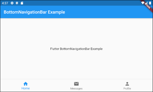
class MyHomePage extends StatelessWidget {
MyHomePage({Key key}) : super(key: key);
@override
Widget build(BuildContext context) {
return Scaffold(
appBar: AppBar(
title: Text("BottomNavigationBar Example"),
),
body: Center(
child: Text(
'Flutter BottomNavigationBar Example',
)
),
bottomNavigationBar: BottomNavigationBar(
items: [
BottomNavigationBarItem(
icon: Icon(Icons.home),
title: Text("Home"),
),
BottomNavigationBarItem(
icon: Icon(Icons.mail),
title: Text("Messages"),
),
BottomNavigationBarItem(
icon: Icon(Icons.person),
title: Text("Profile"),
)
],
),
);
}
}4. onTap
onTap - это функция callback, которая будет вызвана, когда пользователь нажмет на элемент панели BottomNavigationBar.
ValueChanged<int> onTap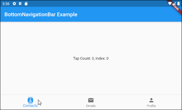
main.dart (onTab ex1)
import 'package:flutter/material.dart';

void main() {
  runApp(MyApp());
}

class MyApp extends StatelessWidget {
  @override
  Widget build(BuildContext context) {
    return MaterialApp(
      title: 'Title of Application',
      theme: ThemeData(
        primarySwatch: Colors.blue,
        visualDensity: VisualDensity.adaptivePlatformDensity,
      ),
      home: MyHomePage(),
    );
  }
}

class MyHomePage extends StatefulWidget {
  MyHomePage({Key key}) : super(key: key);

  @override
  State<StatefulWidget> createState() {
    return MyHomePageState();
  }

}

class MyHomePageState extends State<MyHomePage> {
  int tapCount = 0;
  int selectedIndex = 0;

  @override
  Widget build(BuildContext context) {
    return Scaffold(
      appBar: AppBar(
        title: Text("BottomNavigationBar Example"),
      ),
      body: Center(
          child: Text("Tap Count: " + this.tapCount.toString()
                       + ", Index: " + this.selectedIndex.toString())
      ),
      bottomNavigationBar: BottomNavigationBar(
        currentIndex: this.selectedIndex,
        items: [
          BottomNavigationBarItem(
            icon: Icon(Icons.contacts),
            title: Text("Contacts"),
          ),
          BottomNavigationBarItem(
            icon: Icon(Icons.mail),
            title: Text("Emails"),
          ),
          BottomNavigationBarItem(
            icon: Icon(Icons.person),
            title: Text("Profile"),
          )
        ],
        onTap: (int index) {
          this.onTapHandler(index);
        },
      ),
    );
  }

  void onTapHandler(int index)  {
    this.setState(() {
      this.tapCount++;
      this.selectedIndex = index;
    });
  }
}
5. currentIndex
currentIndex - это индекс выбранного в данный момент элемента панели BottomNavigationBar. Его значение по умолчанию равно 0, что соответствует первому элементу.
int currentIndex: 07. iconSize
Свойство iconSize используется для указания размера значка для всех BottomNavigationBarItem.
double iconSize: 24.0
iconSize (ex1)
BottomNavigationBar(
  currentIndex: this.selectedIndex,
  iconSize: 48,
  items: [
    BottomNavigationBarItem(
      icon: Icon(Icons.contacts),
      title: Text("Contacts"),
    ),
    BottomNavigationBarItem(
      icon: Icon(Icons.mail),
      title: Text("Emails"),
    ),
    BottomNavigationBarItem(
      icon: Icon(Icons.person),
      title: Text("Profile"),
    )
  ],
  onTap: (int index) {
    this.setState(() {
      this.selectedIndex = index;
    });
  },
),
8. selectedIconTheme
Свойство selectedIconTheme используется для указания размера (size), цвета (color) и непрозрачности (opacity) выбранного значка BottomNavigationBarItem.
IconThemeData selectedIconThemeIconThemeData Constructor
const IconThemeData (
    {Color color,
    double opacity,
    double size}
)
Если используется selectedIconTheme, необходимо указать значение для свойства unselectedIconTheme. В противном случае вы не увидите значков на невыбранных BottomNavigationBarItem.

selectedIconTheme (ex1)
BottomNavigationBar(
  currentIndex: this.selectedIndex,
  selectedIconTheme: IconThemeData (
      color: Colors.red,
      opacity: 1.0,
      size: 30
  ),
  items: [
    BottomNavigationBarItem(
      icon: Icon(Icons.contacts),
      title: Text("Contacts"),
    ),
    BottomNavigationBarItem(
      icon: Icon(Icons.mail),
      title: Text("Emails"),
    ),
    BottomNavigationBarItem(
      icon: Icon(Icons.person),
      title: Text("Profile"),
    )
  ],
  onTap: (int index) {
    this.setState(() {
      this.selectedIndex = index;
    });
  },
)
9. unselectedIconTheme
Свойство unselectedIconTheme используется для указания размера (size), цвета (color) и непрозрачности (opacity) значка для невыбранных BottomNavigationBarItem.
IconThemeData unselectedIconThemeIconThemeData constructor
const IconThemeData (
    {Color color,
    double opacity,
    double size}
)
Если используется unselectedIconTheme, необходимо указать значение для свойства selectedIconTheme. В противном случае вы не увидите значок на выбранном BottomNavigationBarItem.
unselectedIconTheme (ex1)
BottomNavigationBar(
  currentIndex: this.selectedIndex,
  selectedIconTheme: IconThemeData (
      color: Colors.red,
      opacity: 1.0,
      size: 45
  ),
  unselectedIconTheme: IconThemeData (
      color: Colors.black45,
      opacity: 0.5,
      size: 25
  ),
  items: [
    BottomNavigationBarItem(
      icon: Icon(Icons.contacts),
      title: Text("Contacts"),
    ),
    BottomNavigationBarItem(
      icon: Icon(Icons.mail),
      title: Text("Emails"),
    ),
    BottomNavigationBarItem(
      icon: Icon(Icons.person),
      title: Text("Profile"),
    )
  ],
  onTap: (int index) {
    this.setState(() {
      this.selectedIndex = index;
    });
  },
),
10. selectedLabelStyle
Свойство selectedLabelStyle используется для указания стиля текста на метке выбранного BottomNavigationBarItem.
TextStyle selectedLabelStyle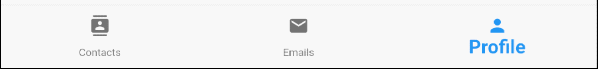
selectedLabelStyle (ex1)
BottomNavigationBar(
  currentIndex: this.selectedIndex,
  selectedLabelStyle: TextStyle(fontWeight: FontWeight.bold, fontSize: 22),
  items: [
    BottomNavigationBarItem(
      icon: Icon(Icons.contacts),
      title: Text("Contacts"),
    ),
    BottomNavigationBarItem(
      icon: Icon(Icons.mail),
      title: Text("Emails"),
    ),
    BottomNavigationBarItem(
      icon: Icon(Icons.person),
      title: Text("Profile"),
    )
  ],
  onTap: (int index) {
    this.setState(() {
      this.selectedIndex = index;
    });
  },
)
11. unselectedLabelStyle
Свойство unselectedLabelStyle используется для указания стиля текста на метке невыбранных BottomNavigationBarItem.
TextStyle unselectedLabelStyle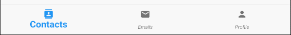
unselectedLabelStyle (ex1)
BottomNavigationBar(
  currentIndex: this.selectedIndex,
  selectedLabelStyle: TextStyle(fontWeight: FontWeight.bold, fontSize: 22),
  unselectedLabelStyle: TextStyle(fontStyle: FontStyle.italic),
  items: [
    BottomNavigationBarItem(
      icon: Icon(Icons.contacts),
      title: Text("Contacts"),
    ),
    BottomNavigationBarItem(
      icon: Icon(Icons.mail),
      title: Text("Emails"),
    ),
    BottomNavigationBarItem(
      icon: Icon(Icons.person),
      title: Text("Profile"),
    )
  ],
  onTap: (int index) {
    this.setState(() {
      this.selectedIndex = index;
    });
  },
)
12. showSelectedLabels
Свойство showSelectedLabels используется для разрешения или и запрета отображения метки (label) на выбранном BottomNavigationBarItem. Его значение по умолчанию равно true.
bool showSelectedLabels: true
showSelectedLabels (ex1)
BottomNavigationBar(
  currentIndex: this.selectedIndex,
  showSelectedLabels: false,
  items: [
    BottomNavigationBarItem(
      icon: Icon(Icons.contacts),
      title: Text("Contacts"),
    ),
    BottomNavigationBarItem(
      icon: Icon(Icons.mail),
      title: Text("Emails"),
    ),
    BottomNavigationBarItem(
      icon: Icon(Icons.person),
      title: Text("Profile"),
    )
  ],
  onTap: (int index) {
    this.setState(() {
      this.selectedIndex = index;
    });
  },
)
13. showUnselectedLabels
Свойство showUnselectedLabels используется для разрешения или и запрета отображения метки (label) на выбранном на невыбранном BottomNavigationBarItem. Его значение по умолчанию равно true.
bool showUnselectedLabels
showUnselectedLabels (ex1)
BottomNavigationBar(
  currentIndex: this.selectedIndex,
  showUnselectedLabels: false,
  items: [
    BottomNavigationBarItem(
      icon: Icon(Icons.contacts),
      title: Text("Contacts"),
    ),
    BottomNavigationBarItem(
      icon: Icon(Icons.mail),
      title: Text("Emails"),
    ),
    BottomNavigationBarItem(
      icon: Icon(Icons.person),
      title: Text("Profile"),
    )
  ],
  onTap: (int index) {
    this.setState(() {
      this.selectedIndex = index;
    });
  },
)
14. selectedFontSize
Свойство selectedFontSize используется для указания размера шрифта на выбранном BottomNavigationBarItem. Его значение по умолчанию равно 14.
double selectedFontSize: 14.0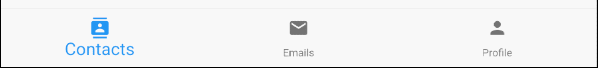
selectedFontSize (ex1)
BottomNavigationBar(
  currentIndex: this.selectedIndex,
  selectedFontSize: 20,
  items: [
    BottomNavigationBarItem(
      icon: Icon(Icons.contacts),
      title: Text("Contacts"),
    ),
    BottomNavigationBarItem(
      icon: Icon(Icons.mail),
      title: Text("Emails"),
    ),
    BottomNavigationBarItem(
      icon: Icon(Icons.person),
      title: Text("Profile"),
    )
  ],
  onTap: (int index) {
    this.setState(() {
      this.selectedIndex = index;
    });
  },
)
15. unselectedFontSize
Свойство selectedFontSize используется для указания размера шрифта на невыбранном BottomNavigationBarItem. Его значение по умолчанию равно 12
double unselectedFontSize: 12.0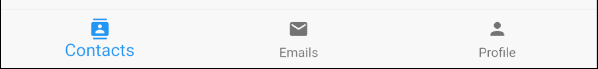
unselectedFontSize (ex1)
BottomNavigationBar(
  currentIndex: this.selectedIndex,
  selectedFontSize: 20,
  unselectedFontSize: 15,
  items: [
    BottomNavigationBarItem(
      icon: Icon(Icons.contacts),
      title: Text("Contacts"),
    ),
    BottomNavigationBarItem(
      icon: Icon(Icons.mail),
      title: Text("Emails"),
    ),
    BottomNavigationBarItem(
      icon: Icon(Icons.person),
      title: Text("Profile"),
    )
  ],
  onTap: (int index) {
    this.setState(() {
      this.selectedIndex = index;
    });
  },
)
16. backgroundColor
Свойство backgroundColor используется для указания цвета фона BottomNavigationBar.
Color backgroundColor
backgroundColor (ex1)
BottomNavigationBar(
  currentIndex: this.selectedIndex,
  backgroundColor : Colors.greenAccent,
  items: [
    BottomNavigationBarItem(
      icon: Icon(Icons.contacts),
      title: Text("Contacts"),
    ),
    BottomNavigationBarItem(
      icon: Icon(Icons.mail),
      title: Text("Emails"),
    ),
    BottomNavigationBarItem(
      icon: Icon(Icons.person),
      title: Text("Profile"),
    )
  ],
  onTap: (int index) {
    this.setState(() {
      this.selectedIndex = index;
    });
  },
)
17. selectedItemColor
Свойство selectedItemColor используется для указания цвета выбранного BottomNavigationBarItem, который работает для значка и метки.
Примечание: Свойство selectedItemColor аналогично свойству fixedColor, и вам разрешено использовать только одно из этих двух свойств.
Color selectedItemColor
selectedItemColor (ex1)
BottomNavigationBar(
  currentIndex: this.selectedIndex,
  selectedItemColor : Colors.red,
  items: [
    BottomNavigationBarItem(
      icon: Icon(Icons.contacts),
      title: Text("Contacts"),
    ),
    BottomNavigationBarItem(
      icon: Icon(Icons.mail),
      title: Text("Emails"),
    ),
    BottomNavigationBarItem(
      icon: Icon(Icons.person),
      title: Text("Profile"),
    )
  ],
  onTap: (int index) {
    this.setState(() {
      this.selectedIndex = index;
    });
  },
)
18. unselectedItemColor
Свойство unselectedItemColor используется для указания цвета невыбранного BottomNavigationBarItem, который работает для значка и метки.
Color unselectedItemColor
unselectedItemColor (ex1)
BottomNavigationBar(
  currentIndex: this.selectedIndex,
  selectedItemColor : Colors.red,
  unselectedItemColor: Colors.cyan,
  items: [
    BottomNavigationBarItem(
      icon: Icon(Icons.contacts),
      title: Text("Contacts"),
    ),
    BottomNavigationBarItem(
      icon: Icon(Icons.mail),
      title: Text("Emails"),
    ),
    BottomNavigationBarItem(
      icon: Icon(Icons.person),
      title: Text("Profile"),
    )
  ],
  onTap: (int index) {
    this.setState(() {
      this.selectedIndex = index;
    });
  },
)
19. fixedColor
Свойство fixedColor аналогично свойству selectedItemColor. Оба они используются для указания цвета выбранного BottomNavigationBarItem. Это работает для значка и метки.
Примечание: fixedColor - это старое название, которое все ещё доступно для обратной совместимости (backwards compatibility). Вам лучше использовать свойство selectedItemColor и нельзя использовать оба одновременно.
Color fixedColor
fixedColor (ex1)
BottomNavigationBar(
  currentIndex: this.selectedIndex,
  fixedColor: Colors.red,
  items: [
    BottomNavigationBarItem(
      icon: Icon(Icons.contacts),
      title: Text("Contacts"),
    ),
    BottomNavigationBarItem(
      icon: Icon(Icons.mail),
      title: Text("Emails"),
    ),
    BottomNavigationBarItem(
      icon: Icon(Icons.person),
      title: Text("Profile"),
    )
  ],
  onTap: (int index) {
    this.setState(() {
      this.selectedIndex = index;
    });
  },
)No ADS
Pуководства Flutter
- Руководство Flutter Column
- Руководство Flutter Stack
- Руководство Flutter IndexedStack
- Руководство Flutter Spacer
- Руководство Flutter Expanded
- Руководство Flutter SizedBox
- Руководство Flutter Tween
- Установите Flutter SDK в Windows
- Установите Flutter Plugin для Android Studio
- Создайте свое первое приложение Flutter - Hello Flutter
- Руководство Flutter Scaffold
- Руководство Flutter AppBar
- Руководство Flutter BottomAppBar
- Руководство Flutter TextButton
- Руководство Flutter ElevatedButton
- Руководство Flutter EdgeInsetsGeometry
- Руководство Flutter EdgeInsets
- Руководство Flutter CircularProgressIndicator
- Руководство Flutter LinearProgressIndicator
- Руководство Flutter Center
- Руководство Flutter Align
- Руководство Flutter Row
- Руководство Flutter SplashScreen
- Руководство Flutter Alignment
- Руководство Flutter Positioned
- Руководство Flutter SimpleDialog
- Руководство Flutter AlertDialog
- Navigation и Routing в Flutter
- Руководство Flutter TabBar
- Руководство Flutter Banner
- Руководство Flutter BottomNavigationBar
- Руководство Flutter FancyBottomNavigation
- Руководство Flutter Card
- Руководство Flutter Border
- Руководство Flutter ContinuousRectangleBorder
- Руководство Flutter RoundedRectangleBorder
- Руководство Flutter CircleBorder
- Руководство Flutter StadiumBorder
- Руководство Flutter Container
- Руководство Flutter RotatedBox
- Руководство Flutter CircleAvatar
- Руководство Flutter IconButton
- Руководство Flutter FlatButton
- Руководство Flutter SnackBar
Show More