Руководство Flutter CircularProgressIndicator
1. CircularProgressIndicator
CircularProgressIndicator - это подкласс ProgressIndicator, который создает круговой индикатор прогресса (progress indicator).
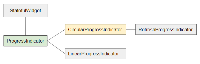
- LinearProgressIndicator
- ProgressIndicator
CircularProgressIndicator делится на два типа:
Determinate
Determinate (определенный): это индикатор прогресса, который показывает пользователю процент выполненной работы на основе значения свойства value (значение в диапазоне от 0 до 1).
Indeterminate
Indeterminate (неопределенный): это индикатор прогресса, который не определяет процент выполненной работы и не указывает время окончания.
CircularProgressIndicator Constructor:
CircularProgressIndicator constructor
const CircularProgressIndicator(
{Key key,
double value,
Color backgroundColor,
Animation<Color> valueColor,
double strokeWidth: 4.0,
String semanticsLabel,
String semanticsValue}
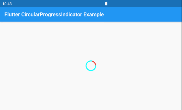
)2. Example: Indeterminate
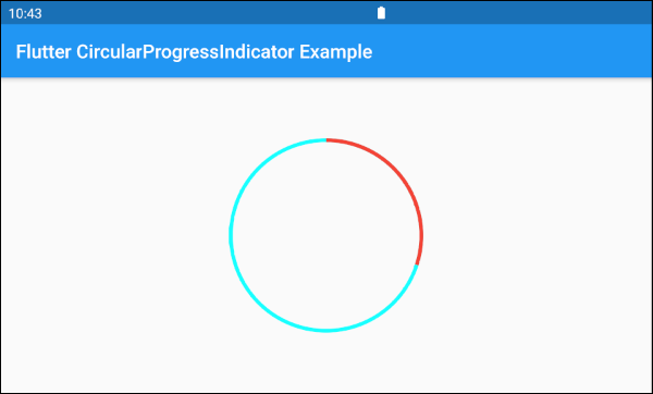
Начнем с простейшего примера: CircularProgressIndicator имитирует процесс, который активен, но не указывает процент выполнения и время окончания работы.
main.dart (ex 1)
import 'package:flutter/material.dart';

void main() => runApp(MyApp());

class MyApp extends StatelessWidget {
  @override
  Widget build(BuildContext context) {
    return MaterialApp(
      title: 'o7planning.org',
      debugShowCheckedModeBanner: false,
      home: HomePage(),
    );
  }
}

class HomePage extends StatelessWidget {

  @override
  Widget build(BuildContext context) {
    return Scaffold(
      appBar: AppBar(
        title: Text('Flutter CircularProgressIndicator Example'),
      ),
      body: Center(
        child:  CircularProgressIndicator(
          backgroundColor: Colors.cyanAccent,
          valueColor: new AlwaysStoppedAnimation<Color>(Colors.red),
        ),
      ),
    );
  }
}
По умолчанию CircularProgressIndicator имеет довольно небольшой радиус, но если вы хотите изменить его размер, давайте поместим его в SizedBox.
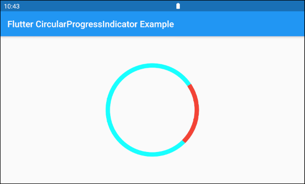
SizedBox(
  width: 200,
  height: 200,
  child: CircularProgressIndicator(
    strokeWidth: 10,
    backgroundColor: Colors.cyanAccent,
    valueColor: new AlwaysStoppedAnimation<Color>(Colors.red),
  ),
)Параметр valueColor используется для задания цветовой анимации хода выполнения (progress) CircularProgressIndicator, например:
valueColor: new AlwaysStoppedAnimation<Color>(Colors.red)AlwaysStoppedAnimation<Color> всегда останавливает анимацию CircularProgressIndicator , если параметр value является конкретным значением, а не null.
SizedBox(
  width: 200,
  height: 200,
  child: CircularProgressIndicator(
    value: 0.3,
    backgroundColor: Colors.cyanAccent,
    valueColor: new AlwaysStoppedAnimation<Color>(Colors.red),
  ),
)
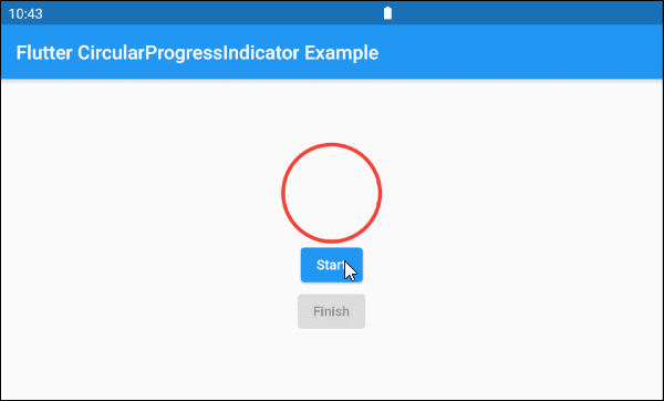
Основываясь на вышеупомянутых особенностях параметров value и valueColor, вы можете управлять поведением CircularProgressIndicator. Давайте рассмотрим пример:
main.dart (ex 1d)
import 'package:flutter/material.dart';

void main() => runApp(MyApp());

class MyApp extends StatelessWidget {
  @override
  Widget build(BuildContext context) {
    return MaterialApp(
      title: 'o7planning.org',
      debugShowCheckedModeBanner: false,
      home: HomePage(),
    );
  }
}

class HomePage extends StatefulWidget {

  @override
  State<StatefulWidget> createState() {
    return _HomePageState();
  }
}

class _HomePageState extends State<HomePage> {

  bool _working = false;

  void startWorking() async {
    this.setState(() {
      this._working = true;
    });
  }

  void finishWorking() {
    this.setState(() {
      this._working = false;
    });
  }

  @override
  Widget build(BuildContext context) {
    return Scaffold(
      appBar: AppBar(
        title: Text('Flutter CircularProgressIndicator Example'),
      ),
      body: Center(
          child:  Column (
              mainAxisAlignment: MainAxisAlignment.center,
              children:  [
                SizedBox(
                  width: 100,
                  height: 100,
                  child: CircularProgressIndicator(
                    value: this._working? null: 1,
                    backgroundColor: Colors.cyanAccent,
                    valueColor: new AlwaysStoppedAnimation<Color>(Colors.red),
                  ),
                ),
                ElevatedButton(
                    child: Text("Start"),
                    onPressed: this._working? null: () {
                      this.startWorking();
                    }
                ),
                ElevatedButton(
                    child: Text("Finish"),
                    onPressed: !this._working? null: () {
                      this.finishWorking();
                    }
                )
              ]
          )
      ),
    );
  }
}
3. Example: Determinate
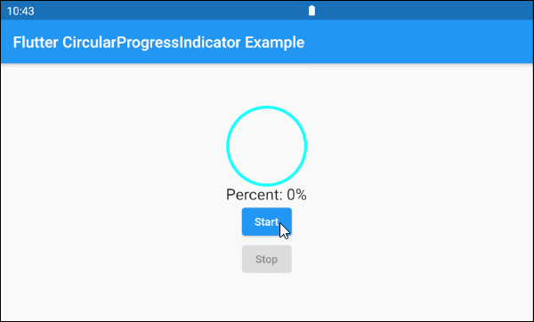
В следующем примере CircularProgressIndicator используется для отображения прогресса с информацией о проценте выполненной работы. Параметр value имеет значение от 0 до 1.
main.dart (ex 2)
import 'package:flutter/material.dart';

void main() => runApp(MyApp());

class MyApp extends StatelessWidget {
  @override
  Widget build(BuildContext context) {
    return MaterialApp(
      title: 'o7planning.org',
      debugShowCheckedModeBanner: false,
      home: HomePage(),
    );
  }
}

class HomePage extends StatefulWidget {

  @override
  State<StatefulWidget> createState() {
    return _HomePageState();
  }
}

class _HomePageState extends State<HomePage> {

  double _value = 0;
  bool _working = false;

  void startWorking()  async {
    this.setState(() {
      this._working = true;
      this._value = 0;
    });
    for(int i = 0; i< 10; i++) {
      if(!this._working)  {
         break;
      }
      await Future.delayed(Duration(seconds: 1));
      this.setState(() {
        this._value += 0.1;
      });
    }
    this.setState(() {
      this._working = false;
    });
  }

  void stopWorking() {
    this.setState(() {
      this._working = false;
    });
  }

  @override
  Widget build(BuildContext context) {
    return Scaffold(
      appBar: AppBar(
        title: Text('Flutter CircularProgressIndicator Example'),
      ),
      body: Center(
          child:  Column (
              mainAxisAlignment: MainAxisAlignment.center,
              children:  [
                SizedBox(
                  width: 100,
                  height: 100,
                  child: CircularProgressIndicator(
                    value: this._value,
                    backgroundColor: Colors.cyanAccent,
                    valueColor: new AlwaysStoppedAnimation<Color>(Colors.red),
                  ),
                ),
                Text(
                  "Percent: " + (this._value * 100).round().toString()+ "%",
                  style: TextStyle(fontSize: 20),
                ),
                ElevatedButton(
                    child: Text("Start"),
                    onPressed: this._working? null: () {
                      this.startWorking();
                    }
                ),
                ElevatedButton(
                    child: Text("Stop"),
                    onPressed: !this._working? null: () {
                      this.stopWorking();
                    }
                )
              ]
          )
      ),
    );
  }
}
4. backgroundColor
backgroundColor используется для установки цвета фона CircularProgressIndicator.
Color backgroundColor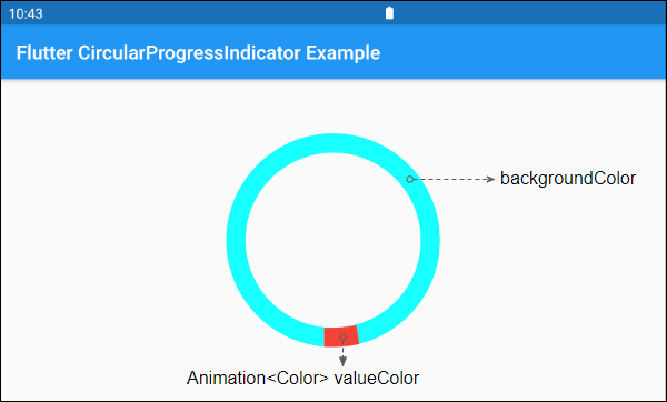
6. valueColor
valueColor используется для указания цветовой анимации хода выполнения (progress).
Animation<Color> valueColor
Например:
CircularProgressIndicator(
  strokeWidth: 20,
  backgroundColor: Colors.cyanAccent,
  valueColor: new AlwaysStoppedAnimation<Color>(Colors.red),
)- Руководство Flutter Animation
7. strokeWidth
strokeWidth - это ширина обводки круга (circle stroke). Её значение по умолчанию - 4 pixel.
double strokeWidth: 4.08. semanticsLabel
semanticsLabel используется для описания предполагаемого использования CircularProgressIndicator. Она полностью скрыта на интерфейсе и имеет значение для экранного считывающего устройства (Screen reader), например считывающие устройства для слепых людей.
String semanticsLabel9. semanticsValue
semanticsValue полностью скрыто на экране. Её цель - предоставить информацию о текущем прогрессе для экранного считывающего устройства.
По умолчанию значением semanticsValue является процент выполненной работы. Например, значение свойства value равно 0,3 - это означает, что значение semanticsValue равно "30%".
String semanticsValueVí dụ:
CircularProgressIndicator(
  value: this._value,
  backgroundColor: Colors.cyanAccent,
  valueColor: new AlwaysStoppedAnimation<Color>(Colors.red),
  semanticsLabel: "Downloading file abc.mp3",
  semanticsValue: "Percent " + (this._value * 100).toString() + "%",
)
Pуководства Flutter
- Руководство Flutter Column
- Руководство Flutter Stack
- Руководство Flutter IndexedStack
- Руководство Flutter Spacer
- Руководство Flutter Expanded
- Руководство Flutter SizedBox
- Руководство Flutter Tween
- Установите Flutter SDK в Windows
- Установите Flutter Plugin для Android Studio
- Создайте свое первое приложение Flutter - Hello Flutter
- Руководство Flutter Scaffold
- Руководство Flutter AppBar
- Руководство Flutter BottomAppBar
- Руководство Flutter TextButton
- Руководство Flutter ElevatedButton
- Руководство Flutter EdgeInsetsGeometry
- Руководство Flutter EdgeInsets
- Руководство Flutter CircularProgressIndicator
- Руководство Flutter LinearProgressIndicator
- Руководство Flutter Center
- Руководство Flutter Align
- Руководство Flutter Row
- Руководство Flutter SplashScreen
- Руководство Flutter Alignment
- Руководство Flutter Positioned
- Руководство Flutter SimpleDialog
- Руководство Flutter AlertDialog
- Navigation и Routing в Flutter
- Руководство Flutter TabBar
- Руководство Flutter Banner
- Руководство Flutter BottomNavigationBar
- Руководство Flutter FancyBottomNavigation
- Руководство Flutter Card
- Руководство Flutter Border
- Руководство Flutter ContinuousRectangleBorder
- Руководство Flutter RoundedRectangleBorder
- Руководство Flutter CircleBorder
- Руководство Flutter StadiumBorder
- Руководство Flutter Container
- Руководство Flutter RotatedBox
- Руководство Flutter CircleAvatar
- Руководство Flutter IconButton
- Руководство Flutter FlatButton
- Руководство Flutter SnackBar
Show More