Руководство Flutter TabBar
1. Flutter Tab
TAB - это макет интерфейса, который широко используется в различных фреймворках разработки приложений, и Flutter не является исключением. Flutter предоставляет простой способ создания макета TAB с помощью библиотеки Material.
В основном, для созадания макета TAB в Flutter, вам необходимо выполнить следующие шаги:
- Создание TabController.
- Создание TabBar.
- Создание TabBarView.
TabController
Чтобы макет TAB работал, необходимо синхронизировать выбранный Tab с его содержимым, что является задачей TabController.
Вы можете создать TabController вручную или использовать доступный Widget, известный как DefaultTabController, который поддерживает некоторые общие функции.
TabController
DefaultTabController(
  // The number of tabs / content sections to display.
  length: 3,
  child: // Complete this code in the next step.
);
TabBar
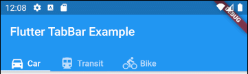
TabBar помогает вам создавать Tab, как в приведенном ниже примере, TabBar содержит три subTab(s).
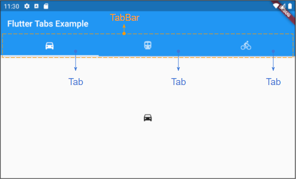
TabBar
DefaultTabController(
  length: 3,
  child: Scaffold(
    appBar: AppBar(
      bottom: TabBar(
        tabs: [
          Tab(icon: Icon(Icons.directions_car)),
          Tab(icon: Icon(Icons.directions_transit)),
          Tab(icon: Icon(Icons.directions_bike)),
        ],
      ),
    ),
  ),
);
Примечание: Вы можете поместить несколько TabBar в DefaultTabController, но DefaultTabController будет работать только с ближайшим TabBar (поиск по структуре дерева). Поэтому в этом случае вам нужно рассмотреть возможность создания собственного TabController вручную.
TabBarView
Вы можете использовать TabBarView для хранения содержимого, соответствующего каждому Tab на TabBar.
TabBarView
TabBarView (
children: [
Icon(Icons.directions_car),
Icon(Icons.directions_transit),
Icon(Icons.directions_bike),
],
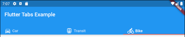
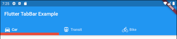
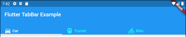
);2. TabBar example
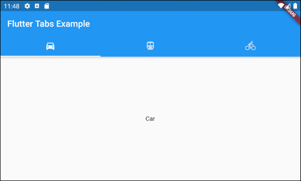
main.dart (ex1)
import 'package:flutter/material.dart';

void main() {
  runApp(MyApp());
}

class MyApp extends StatelessWidget {
  // This widget is the root of your application.
  @override
  Widget build(BuildContext context) {
    return MaterialApp(
      title: 'Title of Application',
      theme: ThemeData(
        primarySwatch: Colors.blue,
        visualDensity: VisualDensity.adaptivePlatformDensity,
      ),
      home: MyHomePage(),
    );
  }
}

class MyHomePage extends StatelessWidget {
  MyHomePage({Key key}) : super(key: key);

  @override
  Widget build(BuildContext context) {
    return DefaultTabController(
        length: 3,
        child: Scaffold(
          appBar: AppBar(
            bottom: TabBar(
              tabs: [
                Tab(icon: Icon(Icons.directions_car)),
                Tab(icon: Icon(Icons.directions_transit)),
                Tab(icon: Icon(Icons.directions_bike)),
              ],
            ),
            title: Text('Flutter Tabs Example'),
          ),
          body: TabBarView(
            children: [
              Center(child: Text("Car")),
              Center(child: Text("Transit")),
              Center(child: Text("Bike"))
            ],
          ),
        )
    );
  }
}
3. TabController, TabBar ... Constructor
TabController Constructor
TabController Constructor
TabController(
    {int initialIndex: 0,
    @required int length,
    @required TickerProvider vsync}
)
DefaultTabController Constructor:
DefaultTabController Constructor
const DefaultTabController(
    {Key key,
    @required int length,
    int initialIndex: 0,
    @required Widget child}
)
TabBar Constructor:
TabBar Constructor
const TabBar(
    {Key key,
    @required List<Widget> tabs,
    TabController controller,
    bool isScrollable: false,
    Color indicatorColor,
    double indicatorWeight: 2.0,
    EdgeInsetsGeometry indicatorPadding: EdgeInsets.zero,
    Decoration indicator,
    TabBarIndicatorSize indicatorSize,
    Color labelColor,
    TextStyle labelStyle,
    EdgeInsetsGeometry labelPadding,
    Color unselectedLabelColor,
    TextStyle unselectedLabelStyle,
    DragStartBehavior dragStartBehavior: DragStartBehavior.start,
    MouseCursor mouseCursor,
    ValueChanged<int> onTap,
    ScrollPhysics physics}
)
TabBarView Constructor:
TabBarView Constructor
const TabBarView(
    {Key key,
    @required List<Widget> children,
    TabController controller,
    ScrollPhysics physics,
    DragStartBehavior dragStartBehavior: DragStartBehavior.start}
)
4. isScrollable
Если isScrollable имеет значение true, каждый Tab будет соответствовать своему содержимому по ширине, а TabBar будет иметь горизонтальную полосу прокрутки (скроллбар).
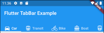
main.dart (isScrollable ex1)
import 'package:flutter/material.dart';
void main() {
runApp(MyApp());
}
class MyApp extends StatelessWidget {
// This widget is the root of your application.
@override
Widget build(BuildContext context) {
return MaterialApp(
title: 'Title of Application',
theme: ThemeData(
primarySwatch: Colors.blue,
visualDensity: VisualDensity.adaptivePlatformDensity,
),
home: MyHomePage(),
);
}
}
class MyHomePage extends StatelessWidget {
MyHomePage({Key key}) : super(key: key);
@override
Widget build(BuildContext context) {
EdgeInsets a2; EdgeInsetsDirectional a;
return DefaultTabController(
length: 6,
child: Scaffold(
appBar: AppBar(
bottom: createTabBar(),
title: Text('Flutter TabBar Example'),
),
body: TabBarView(
children: [
Center(child: Text("Car")),
Center(child: Text("Transit")),
Center(child: Text("Bike")),
Center(child: Text("Boat")),
Center(child: Text("Railway")),
Center(child: Text("Bus"))
],
),
)
);
}
TabBar createTabBar() {
return TabBar(
tabs: [
Row (children: [Icon(Icons.directions_car), SizedBox(width:5), Text("Car")]),
Row (children: [Icon(Icons.directions_transit), SizedBox(width:5), Text("Transit")]),
Row (children: [Icon(Icons.directions_bike), SizedBox(width:5), Text("Bike")]),
Row (children: [Icon(Icons.directions_boat), SizedBox(width:5), Text("Boat")]),
Row (children: [Icon(Icons.directions_railway), SizedBox(width:5), Text("Railway")]),
Row (children: [Icon(Icons.directions_bus), SizedBox(width:5), Text("Bus")]),
],
isScrollable: true,
);
}
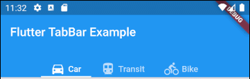
}Например, выравнивание Tab по левому краю при TabBar.isScrollable = true.
main.dart (isScrollable ex2)
import 'package:flutter/material.dart';
void main() {
runApp(MyApp());
}
class MyApp extends StatelessWidget {
// This widget is the root of your application.
@override
Widget build(BuildContext context) {
return MaterialApp(
title: 'Title of Application',
theme: ThemeData(
primarySwatch: Colors.blue,
visualDensity: VisualDensity.adaptivePlatformDensity,
),
home: MyHomePage(),
);
}
}
class MyHomePage extends StatelessWidget {
MyHomePage({Key key}) : super(key: key);
@override
Widget build(BuildContext context) {
EdgeInsets a2; EdgeInsetsDirectional a;
return DefaultTabController(
length: 3,
child: Scaffold(
appBar: AppBar(
bottom: PreferredSize(
preferredSize: Size.fromHeight(40),
child: Align(
alignment: Alignment.centerLeft,
child: TabBar(
isScrollable: true,
tabs: [ Row (children: [Icon(Icons.directions_car), SizedBox(width:5), Text("Car")]),
Row (children: [Icon(Icons.directions_transit), SizedBox(width:5), Text("Transit")]),
Row (children: [Icon(Icons.directions_bike), SizedBox(width:5), Text("Bike")])],
),
),
),
title: Text('Flutter TabBar Example'),
),
body: TabBarView(
children: [
Center(child: Text("Car")),
Center(child: Text("Transit")),
Center(child: Text("Bike"))
],
),
)
);
}
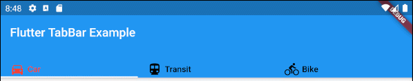
}5. indicatorColor
Свойство indicatorColor позволяет указать цвет линии (line) под текущим выбранным Tab. Это свойство будет проигнорировано, если указано свойство indicator.
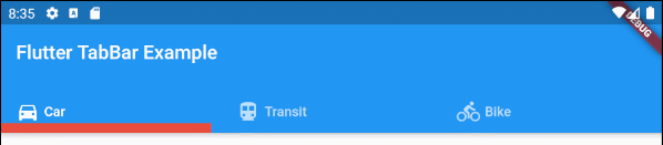
Color indicatorColorНапример: установить красный цвет для линии (line), находящейся под текущим выбранным Tab:
indicatorColor (ex1)
TabBar (
  tabs: [
    Row (children: [Icon(Icons.directions_car), SizedBox(width:5), Text("Car")]),
    Row (children: [Icon(Icons.directions_transit), SizedBox(width:5), Text("Transit")]),
    Row (children: [Icon(Icons.directions_bike), SizedBox(width:5), Text("Bike")]),
  ],
  indicatorColor: Color(0xffE74C3C),
);- Руководство Flutter Color
6. indicatorWeight
Свойства indicatorWeight используется для указания толщины (thickness) линии (line) в соответствии с текущим выбранным Tab. Его значение больше 0, а значение по умолчанию равно 2. Это свойство будет проигнорировано, если указано свойство indicator.
double indicatorWeight;Например, установить толщину (thickness) для линии, находящейся под текущим выбранным Tab.
indicatorWeight (ex1)
TabBar(
  tabs: [
    Row (children: [Icon(Icons.directions_car), SizedBox(width:5), Text("Car")]),
    Row (children: [Icon(Icons.directions_transit), SizedBox(width:5), Text("Transit")]),
    Row (children: [Icon(Icons.directions_bike), SizedBox(width:5), Text("Bike")]),
  ],
  indicatorColor: Color(0xffE74C3C),
  indicatorWeight: 10
);
7. indicatorPadding
Свойство indicatorPadding указывает padding по горизонтали для линии, находящейся под текущим выбранным Tab.
EdgeInsetsGeometry indicatorPadding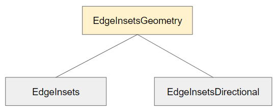
Например:
indicatorPadding (ex1)
TabBar(
  tabs: [
    Row (children: [Icon(Icons.directions_car), SizedBox(width:5), Text("Car")]),
    Row (children: [Icon(Icons.directions_transit), SizedBox(width:5), Text("Transit")]),
    Row (children: [Icon(Icons.directions_bike), SizedBox(width:5), Text("Bike")]),
  ],
  indicatorColor: Color(0xffE74C3C),
  indicatorWeight: 10,
  indicatorPadding: EdgeInsets.only(right: 20),
);
8. indicator
Свойство indicator позволяет определить внешний вид (appearance) текущего выбранного Tab. Если это свойство используется, то другие свойства, такие как ndicatorColor, indicatorWeight и indicatorPadding будут проигнорированы.
Decoration indicator;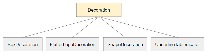
Например:
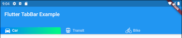
indicator (ex1)
TabBar(
  tabs: [
    Row (children: [Icon(Icons.directions_car), SizedBox(width:5), Text("Car")]),
    Row (children: [Icon(Icons.directions_transit), SizedBox(width:5), Text("Transit")]),
    Row (children: [Icon(Icons.directions_bike), SizedBox(width:5), Text("Bike")]),
  ],
  indicator: ShapeDecoration (
      shape: UnderlineInputBorder (
          borderSide: BorderSide(
              color: Colors.transparent,
              width: 0,
              style: BorderStyle.solid
          )
      ),
      gradient: LinearGradient(colors: [Color(0xff0081ff), Color(0xff01ff80)])
  )
);- Руководство Flutter Decoration
9. labelColor
Свойство labelColor используется для указания цвета текста для метки (label) текущего выбранного Tab.
Color labelColor;Например:
TabBar(
    tabs: [
      Row (children: [Icon(Icons.directions_car), SizedBox(width:5), Text("Car")]),
      Row (children: [Icon(Icons.directions_transit), SizedBox(width:5), Text("Transit")]),
      Row (children: [Icon(Icons.directions_bike), SizedBox(width:5), Text("Bike")]),
    ],
    labelColor: Colors.red,
    unselectedLabelColor: Colors.black,
);
10. unselectedLabelColor
Свойство unselectedLabelColor используется для указания цвета текста для метки (label) невыбранного Tab(s).
Color unselectedLabelColor;Например:
unselectedLabelColor (ex1)
TabBar(
  tabs: [
    Row (children: [Icon(Icons.directions_car), SizedBox(width:5), Text("Car")]),
    Row (children: [Icon(Icons.directions_transit), SizedBox(width:5), Text("Transit")]),
    Row (children: [Icon(Icons.directions_bike), SizedBox(width:5), Text("Bike")]),
  ],
  labelColor: Colors.white,
  unselectedLabelColor: Colors.cyanAccent,
);
11. labelPadding
Свойство labelPadding используется для добавления padding к каждой метке (label) Tab(s).
EdgeInsetsGeometry labelPadding;Например:
labelPadding (ex1)
TabBar(
  tabs: [
    Row (children: [Icon(Icons.directions_car), SizedBox(width:5), Text("Car")]),
    Row (children: [Icon(Icons.directions_transit), SizedBox(width:5), Text("Transit")]),
    Row (children: [Icon(Icons.directions_bike), SizedBox(width:5), Text("Bike")]),
  ],
  labelPadding: EdgeInsets.all( 20),
);
12. labelStyle
Свойство labelStyle используется для указания стиля текста на метке текущего выбранного Tab.
TextStyle labelStyle;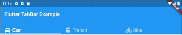
labelStyle (ex1)
TabBar(
  tabs: [
    Row (children: [Icon(Icons.directions_car), SizedBox(width:5), Text("Car")]),
    Row (children: [Icon(Icons.directions_transit), SizedBox(width:5), Text("Transit")]),
    Row (children: [Icon(Icons.directions_bike), SizedBox(width:5), Text("Bike")]),
  ],
  labelStyle: TextStyle(fontWeight: FontWeight.bold, fontSize: 22),
  unselectedLabelStyle: TextStyle(fontStyle: FontStyle.normal, fontSize: 18),
);- Руководство Flutter TextStyle
13. unselectedLabelStyle
Свойство unselectedLabelStyle используется для указания стиля текста на метке невыбранных Tab(s).
TextStyle unselectedLabelStyle;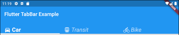
unselectedLabelStyle (ex1)
TabBar(
  tabs: [
    Row (children: [Icon(Icons.directions_car), SizedBox(width:5), Text("Car")]),
    Row (children: [Icon(Icons.directions_transit), SizedBox(width:5), Text("Transit")]),
    Row (children: [Icon(Icons.directions_bike), SizedBox(width:5), Text("Bike")]),
  ],
  labelStyle: TextStyle(fontWeight: FontWeight.bold, fontSize: 22),
  unselectedLabelStyle: TextStyle(fontStyle: FontStyle.italic),
);- Руководство Flutter TextStyle
14. onTap
onTap - это функция callback, которая будет вызвана, когда пользователь нажмет (tap) Tab на TabBar.
ValueChanged<int> onTap;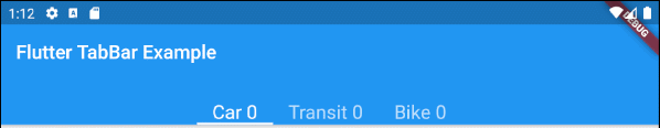
main.dart (onTap ex1)
import 'package:flutter/material.dart';

void main() {
  runApp(MyApp());
}

class MyApp extends StatelessWidget {
  // This widget is the root of your application.
  @override
  Widget build(BuildContext context) {
    return MaterialApp(
      title: 'Title of Application',
      theme: ThemeData(
        primarySwatch: Colors.blue,
        visualDensity: VisualDensity.adaptivePlatformDensity,
      ),
      home: MyHomePage(),
    );
  }
}

class MyHomePage extends StatefulWidget {
  MyHomePage({Key key}) : super(key: key);

  @override
  State<StatefulWidget> createState() {
    return MyHomePageState();
  }
}

class MyHomePageState extends State<MyHomePage> {
  int carClick = 0;
  int transitClick = 0;
  int bikeClick = 0;

  @override
  Widget build(BuildContext context) {
    return DefaultTabController(
        length: 3,
        child: Scaffold(
          appBar: AppBar(
            bottom: createTabBar(),
            title: Text('Flutter TabBar Example'),
          ),
          body: TabBarView(
            children: [
              Center(child: Text("Car")),
              Center(child: Text("Transit")),
              Center(child: Text("Bike"))
            ],
          ),
        )
    );
  }

  TabBar createTabBar()  {
    return TabBar(
        isScrollable: true,
        labelStyle: TextStyle(fontSize: 20),
        tabs: [
          Text("Car " + this.carClick.toString()),
          Text("Transit " + this.transitClick.toString()),
          Text("Bike " + this.bikeClick.toString())
        ],
        onTap: (index) {
          this.onTapHandler(index);
        }
    );
  }

  void onTapHandler(int index)  {
    setState(()  {
      switch(index){
        case 0:
          carClick++;
          break;
        case 1:
          transitClick++;
          break;
        case 2:
          bikeClick++;
          break;
      }
    });
  }

}No ADS
Pуководства Flutter
- Руководство Flutter Column
- Руководство Flutter Stack
- Руководство Flutter IndexedStack
- Руководство Flutter Spacer
- Руководство Flutter Expanded
- Руководство Flutter SizedBox
- Руководство Flutter Tween
- Установите Flutter SDK в Windows
- Установите Flutter Plugin для Android Studio
- Создайте свое первое приложение Flutter - Hello Flutter
- Руководство Flutter Scaffold
- Руководство Flutter AppBar
- Руководство Flutter BottomAppBar
- Руководство Flutter TextButton
- Руководство Flutter ElevatedButton
- Руководство Flutter EdgeInsetsGeometry
- Руководство Flutter EdgeInsets
- Руководство Flutter CircularProgressIndicator
- Руководство Flutter LinearProgressIndicator
- Руководство Flutter Center
- Руководство Flutter Align
- Руководство Flutter Row
- Руководство Flutter SplashScreen
- Руководство Flutter Alignment
- Руководство Flutter Positioned
- Руководство Flutter SimpleDialog
- Руководство Flutter AlertDialog
- Navigation и Routing в Flutter
- Руководство Flutter TabBar
- Руководство Flutter Banner
- Руководство Flutter BottomNavigationBar
- Руководство Flutter FancyBottomNavigation
- Руководство Flutter Card
- Руководство Flutter Border
- Руководство Flutter ContinuousRectangleBorder
- Руководство Flutter RoundedRectangleBorder
- Руководство Flutter CircleBorder
- Руководство Flutter StadiumBorder
- Руководство Flutter Container
- Руководство Flutter RotatedBox
- Руководство Flutter CircleAvatar
- Руководство Flutter IconButton
- Руководство Flutter FlatButton
- Руководство Flutter SnackBar
Show More